
If you’ve used Wibiya, you will have undoubtedly discovered that the toolbar extends the full-width of the browser window. Although it will dynamically resize if you re-size the browser window, it cannot by itself be set to a fixed width. This means that if the content area of your website is 800px wide, the Wibiya toolbar will be wider than your content area and will actually be as wide as your browser window.
Clearly this presents a design dilemma because your beautiful website now has an ungainly toolbar at the bottom of the page that doesn’t fit in with the design of your site.
Although the developers will certainly address this in an upcoming revision, right now the only way to adjust the width is by using a simple CSS hack.
You just need to determine the width that you’d like your Wibiya toolbar to be and insert that width into this little chunk of CSS which you will place in your styles.css file for your website.
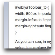
#wibiyaToolbar_tbl{
width: 800px !important;
margin-left:auto !important;
margin-right:auto !important;
}
As you can see, in my code, the width has been set to 800px. If you need the toolbar width to be any other value, just replace the 800px with the value you need.
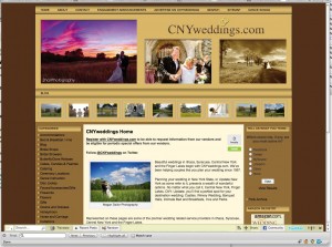
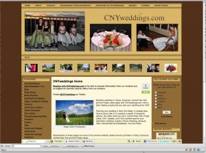
Here is an example of how a site looked with the default Wibiya toolbar and then after applying the CSS hack.


Thanks Michael!
Thanks a lot!!!Cool.
Great job Michael. Many have helped me. Do you know how you might remove the Powered by Wibiya. Once again, thank you very much.
Great Micheal.Thanks for sharing!more power
@dejan – To remove the “Powered by WIbiya” div, add something like below to your CSS. Note that “YourNumber” seemingly references your Wibiya account number.
div.WibiyaToolbarIcon_YourNumber { display:none !important; )
The legal way to remove the “Powered by Wibiya” div is to upgrade your account. I believe that also comes with added features, and recommend that path; nevertheless, it is technically possible to remove that div via CSS.
use this code ..it is working
.wibiyaToolbar_item_anchor{
visibility:hidden;
}
Good job… worked like a charm…
use this code ..it is working
.wibiyaToolbar_item_anchor{
visibility:hidden;
width: 0px !important
}
it`s not work on my joomla website… i place it @template.css
how can i use it in a vb forum ?
I don’t provide support for WIbiya. You’ll have to go to their website for that.
good info i was looking for such a tweak. Working fine on my blog
Hi,
I hv tried implementing the css to my blog but it couldn’t work… am I missing anything?
url: http://taxation-tz.blogspot.com
K
Not for nothing, but the few dollars Wibiya charges for an unbranded bar is very reasonable, considering the functionality they give you. Removing the “Powered by Wibiya” via CSS is just plain wrong, and I hope they have some sort of audit where they terminate your accounts.
Wibiya has clear identification in other areas of the functionality it provides. I hardly think removing the attribution will cause any harm.
Couldn’t help but noticing that you’ve removed the WordPress and Theme attribution in your website. A bit hypocritical of you don’t you think?
Works like a CHARM!!! but the problem it still appearing the powered by wibiya under LIVE CHAT! please help!!! my email is roldannarag@gmail.com or can post here pls?
by matobex
#bottom {
position:fixed;
bottom:0px;
right:0px;
width: 0%;
background: transparent;
text-align: right;
}
this is usefull code for the blog or webs or any site if you like the popup chat like facebook go to this site http://www.tambay.tk
if you want to create a popup chat pc me on that site or copy this code if you want to try thanks comment me
by matobex
#bottom {
position:fixed;
bottom:0px;
right:0px;
width: 0%;
background: transparent;
text-align: right;
}
not work in my blog plese help me….