If you’ve used Wibiya, you will have undoubtedly discovered that the toolbar extends the full-width of the browser window. Although it will dynamically resize if you re-size the browser window, it cannot by itself be set to a fixed width. This means that if the content area of your website is 800px wide, the Wibiya toolbar will be wider than your content area and will actually be as wide as your browser window.
Clearly this presents a design dilemma because your beautiful website now has an ungainly toolbar at the bottom of the page that doesn’t fit in with the design of your site.
Although the developers will certainly address this in an upcoming revision, right now the only way to adjust the width is by using a simple CSS hack.
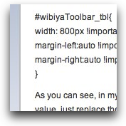
You just need to determine the width that you’d like your Wibiya toolbar to be and insert that width into this little chunk of CSS which you will place in your styles.css file for your website.
#wibiyaToolbar_tbl{
width: 800px !important;
margin-left:auto !important;
margin-right:auto !important;
}
As you can see, in my code, the width has been set to 800px. If you need the toolbar width to be any other value, just replace the 800px with the value you need.
Here is an example of how a site looked with the default Wibiya toolbar and then after applying the CSS hack.


